
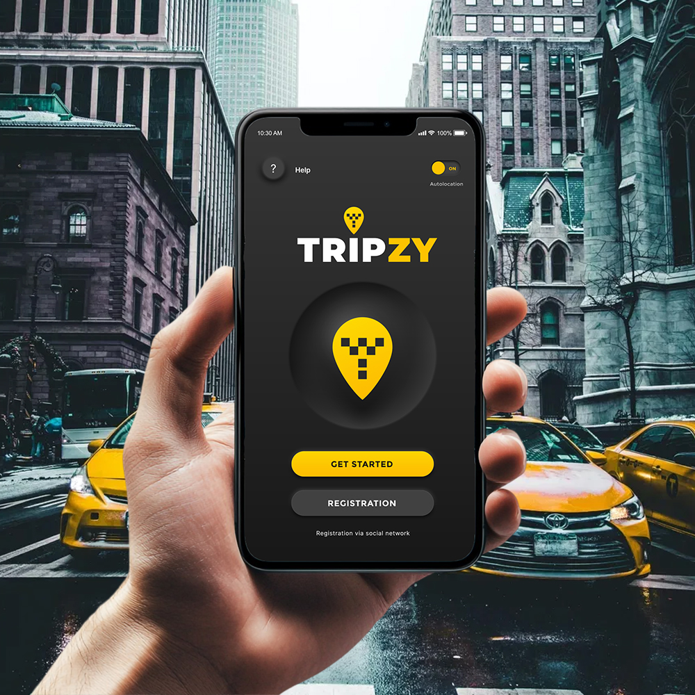
Hail a cab in three taps.
Tripzy is a taxi-hailing app where the price and the driver are settled before you ever open the door. We built the whole product, from the brand and its neumorphic dark UI to the native iOS and Android app.
 Tripzy · iOS
No surge, no surprises.
The fear with any cab app is the unknown: what will it cost, who's driving, how long until they arrive. Tripzy's pitch was to answer all three on one screen, before you commit, and to look like nothing else on the rank while doing it.
A fixed price and a named driver, shown up front. The meter anxiety just disappears.
We leaned into a neumorphic dark look: soft-extruded charcoal controls, a single taxi-yellow that carries every action, and the checker-flag pin as the spine of the identity. We ran it from naming and logo through to the shipped native build on both platforms.
- P1Price was a black box. Riders wanted the fare and the ETA locked before they ordered, not a guess that climbs on arrival.
- P2Who's picking me up? The driver, the car, the rating and the review count all had to sit on one card.
- P3One small team, both stores. iOS and Android had to launch together on a tight runway.
Three screens, one fare.
Open the app, see the price, meet the driver. Each screen settles one of the three questions a rider has before they get in.
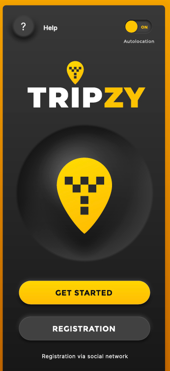
A logo built from a checker pin.
The wordmark splits TRIP in white from ZY in yellow, crowned by a map pin filled with a taxi checker. It sits on a pillow of soft neumorphic shadow, with an Autolocation toggle already flipped on and Help one tap away, so the very first screen feels switched-on.
- Two-tone TRIPZY wordmark and a checker-flag pin mark
- Get Started up top, Registration and social sign-up below
- Autolocation pre-enabled to skip a setup step
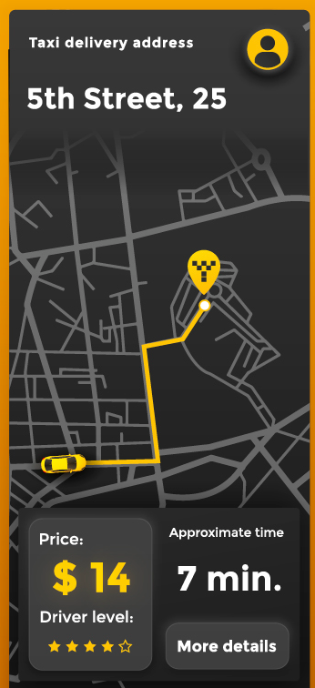
The fare, before you order.
A dark map draws the yellow route from the waiting cab to your pin at 5th Street, 25. The panel underneath commits to the numbers that matter: $14 flat and 7 min away, with the driver's star level and a More details tap if you want the breakdown.
- Custom dark map with a bright yellow pickup-to-pin route
- Locked price and approximate time, side by side
- Driver level stars, with More details for the full fare
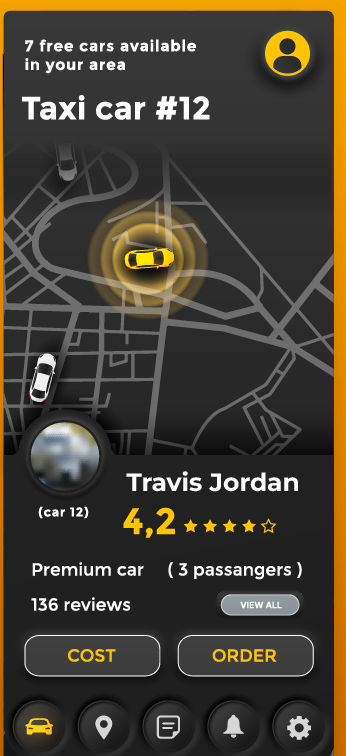
Meet Travis before he arrives.
Tap the cab and the driver card opens: Travis Jordan, car #12, a 4.2 rating across 136 reviews, a premium car seating three. A live map shows him circling closer. Two buttons close it out, Cost to recheck the fare or Order to lock the ride.
- Driver photo, name, rating and 136-review count on one card
- Live "7 free cars available" map with the assigned cab highlighted
- Cost and Order actions over a five-icon neumorphic tab bar
Open, price, order.
Splash to confirmed ride in three screens, each answering one rider question and nothing more.
One yellow, one shadow language.
Everything ships as named tokens and reusable components, so Tripzy's team can build the ride history, the wallet or the next city without redrawing a button.
A single taxi-yellow signals every action; charcoal controls are extruded with paired light and dark shadows. Primary buttons fill yellow, secondary ones sink into the surface.
A single bold sans runs from the fare down to the review count. Weight and size do the work, so price and ETA always read first.
10 weeks, four moves.
Discover
Rider and driver interviews, a teardown of the big hailing apps, and the order flow mapped before any UI.
Brand & design
The TRIPZY mark, the neumorphic dark system, and high-fidelity screens for every step of a booking.
Build
Cross-platform native development with live maps, routing and fare estimation wired into the design system.
Launch
QA, store submission for both platforms, and a handoff the in-house team can run with.
What it delivered.
Across both stores in its first weeks. The reviews that landed kept naming the upfront price as the reason to switch.
iOS and Android launched on the same day from one cross-platform codebase, on budget.
Get Started, confirm the fare, Order. The whole booking fits on three screens with no detours.
Every other cab app makes you guess and then flinch at the total. Siznex gave us a product where the price and the driver are right there before you order, and a system we keep building on city by city.
Have an app in your head?
Brand, design and a native build under one roof, on one timeline. Tell us what you're trying to ship and a real human replies within 24 hours with a plan, not a sales deck.