
An app that makes you want to go.
Trailhead turns a vague urge to get out of town into a booked trip in one sitting: land on a place, trace its route on the map, reserve it. We designed and built the whole product, from brand and immersive UI to the native iOS and Android app.
 Trailhead · iOS
Sell the feeling, not the listing.
Most travel apps render a destination as a database row: thumbnail, star rating, price, Book button. Trailhead's founders wanted the inverse. You open the app and the Squamish backcountry or a Dolomites meadow takes the entire screen, the way it looks through the windshield when you actually pull up to the trailhead.
The landscape owns the screen. The interface earns the few pixels it borrows back.
That dictated a photography-first system: full-bleed imagery, a near-black topographic base so the only colour comes from the place itself, and an interface pared down to the three things a traveller actually does. We ran it from naming and brand through to the shipped native build on both platforms.
- P1Chrome was eating the view. Competing apps stack search bars, filter chips and tab rows between the traveller and the photo that sells the trip.
- P2Browse, decide, book felt like three apps. Those jobs usually live on disconnected screens; here they had to read as one continuous move.
- P3One small team, both stores. iOS and Android had to launch the same week on a seed-stage budget.
Three screens, one journey.
From a cold open to a confirmed booking, the app is three screens. Each one owns a single decision in the journey and hands the rest of the canvas back to the photography.
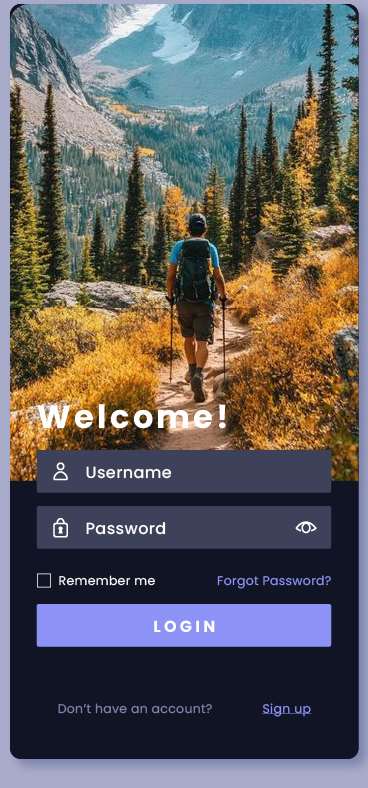
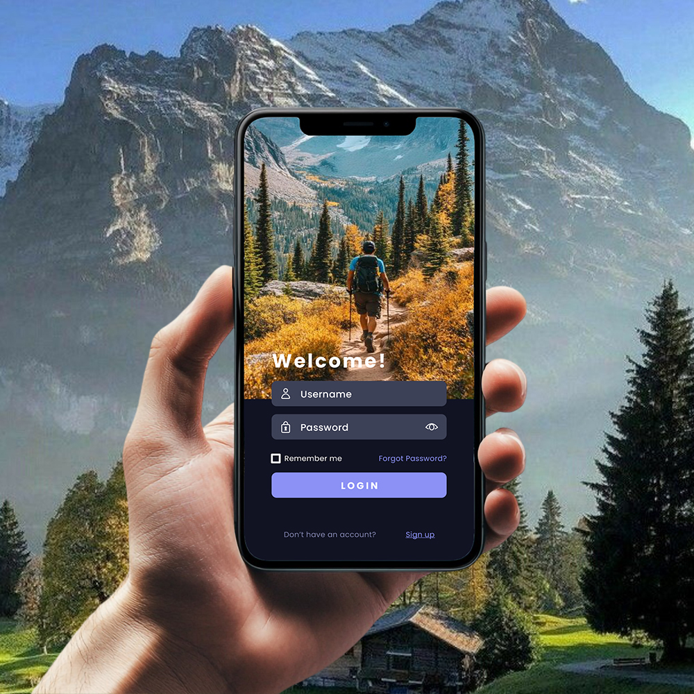
A welcome that feels like a view.
The first screen is a single trail shot at golden hour: a hiker walking away from you into larch and granite. Username, password and a Login button sit in a frosted panel pinned to the bottom third, so signing in reads as part of the photo instead of a form bolted over it.
- Trail photography runs edge to edge, status bar and all
- Frosted-glass fields with a show-password eye and Remember me
- One filled Login; Forgot Password and Sign up kept quiet beneath it
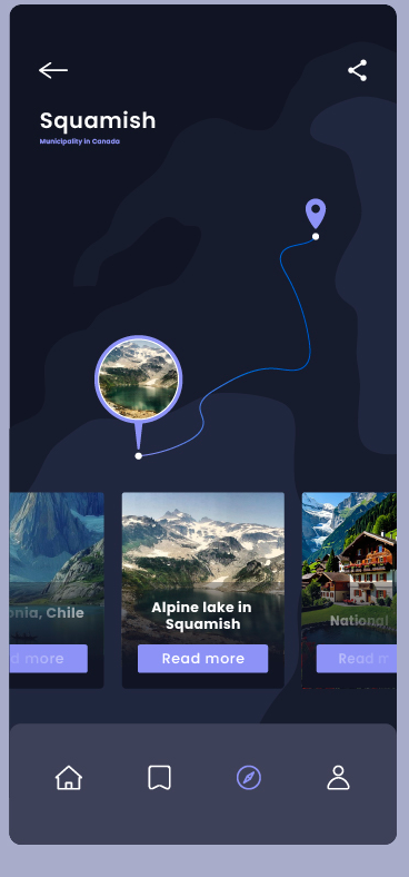
Follow the route, find what's near.
Tap a destination and the map takes over: a dark topographic canvas with one drawn route running from your location pin up to Squamish, and a circular photo-marker that previews the alpine lake before you commit. A carousel of nearby spots (Patagonia in Chile, a national park, the lake itself) slides up from the bottom, every card one tap from Read more.
- Custom dark map style, a single route line, no clutter of pins
- Circular photo-markers that show the place, not a generic teardrop
- Swipe-up carousel of nearby spots over a fixed four-tab bar
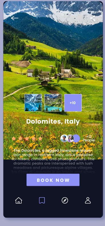
Everything to decide, then Book Now.
The Dolomites page opens on a full-bleed alpine meadow, then stacks the proof a traveller wants before paying: a three-photo strip capped by a +10 tile, a five-star rating, and the overlapping avatars of +12 people already going. A short, magazine-style write-up sits over the image, and the screen resolves on one Book Now.
- Hero image with an inline three-photo gallery and a +10 more tile
- Five-star rating and +12 people going, shown as overlapping avatars
- Editorial copy over the photo, closing on a single Book Now
Discover, explore, go.
Install to confirmed booking runs through exactly three screens. No dead ends, no detours, no fourth tab to learn.
Built to scale to a hundred places.
Everything ships as named tokens and reusable components, so Trailhead's team can publish the next destination, or the next fifty, by dropping in photography and copy without touching layout.
A deep night-sky base lets photography glow; a single periwinkle drives every action and accent. Glassy inputs and soft-rounded buttons keep the chrome quiet.
One sans family runs from the Welcome headline down to a “Municipality in Canada” label. Hierarchy comes from weight and scale, never a second typeface fighting the photos.
12 weeks, four moves.
Discover
Traveller interviews, competitor teardown, and the discover-to-book flow mapped before a single pixel.
Brand & design
Identity, the photography-first design system, and high-fidelity screens for every flow that ships.
Build
Cross-platform native development, live maps and booking wired in, design system baked into the code.
Launch
QA, store submission for both platforms, and a handoff the in-house team can run with.
What it delivered.
Across both stores in its first weeks. The reviews that stuck called it the rare travel app worth opening with no trip planned.
iOS and Android launched on the same day from one cross-platform codebase, on budget.
A documented design system the Trailhead team now extends, destination by destination.
Siznex understood we're not selling listings, we're selling the urge to go. They left us with a product and a system where every place we add looks like it earned the cover of a magazine.
Have an app in your head?
Brand, design and a native build under one roof, on one timeline. Tell us what you're trying to ship and a real human replies within 24 hours with a plan, not a sales deck.