
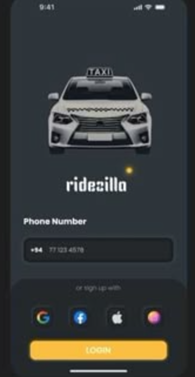
Your city, one tap away.
Ridezilla is a ride-hailing app with two sides to win, drivers who want to earn and riders who want a car now. We built the whole product, from the brand and a dark taxi-gold UI to the native iOS and Android app.
Recruit, book, rate.
Most ride apps treat the driver as an afterthought, all the polish goes to the rider while sign-up is a grey form. Ridezilla wanted both sides to feel premium: an onboarding that actually sells the earnings, a booking flow that's all map and one button, and a sign-off that makes tipping effortless.
Two audiences, one app that respects both.
The look is confident and after-dark: deep charcoal, a single electric taxi-gold, photoreal cabs and a city skyline. We ran it from naming and brand through to the shipped native build on both platforms.
- P1Drivers wouldn't sign up. The pitch lived on a website, not in the app, so onboarding had to lead with earnings, bonuses and a fast approval promise.
- P2Booking had too many steps. Riders wanted a car, not a form, so the map and a single Get A Car action had to carry the flow.
- P3Two apps, one launch. Rider and driver experiences had to share a system and reach both stores on a tight runway.
Three moments, one smooth ride.
An onboarding that recruits drivers, a map that books a car in one tap, and a sign-off that makes tipping effortless.
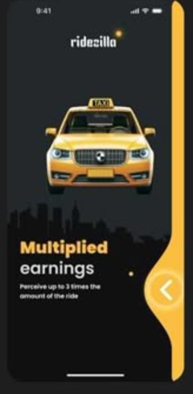
Sell the upside first.
The carousel leads with what drivers actually care about: Multiplied earnings, Exceptional bonuses and a Quick start, each on its own photoreal cab against the city skyline. A bold gold headline, one line of plain copy, and a single forward arrow, no wall of terms.
- Earnings, bonuses and fast approval, one promise per screen
- Photoreal cabs on a dark skyline with a signature gold sweep
- A validated registration in under 12 hours
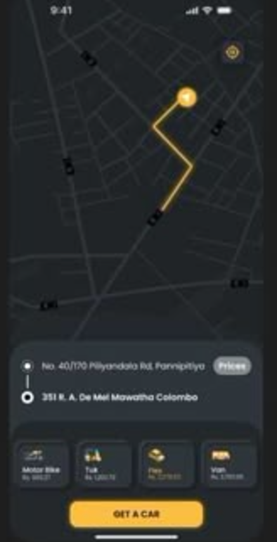
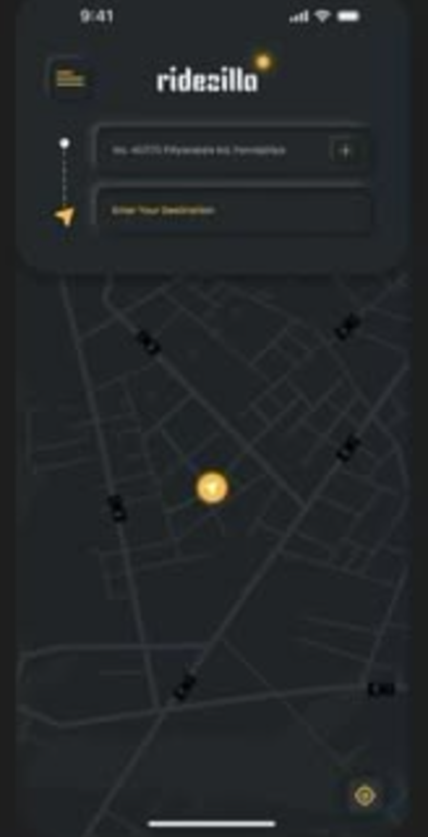
A car in one tap.
Riders set a pickup and destination, then the map does the talking, a clear gold route with pickup and drop pins. A tidy card shows both addresses with a Prices peek, a row of vehicle types, Motor Bike, Tuk, Flex and Van, and one confident Get A Car button anchored at the bottom.
- A dark map with a high-contrast gold route and clear pins
- Pickup and drop addresses with an at-a-glance price peek
- Motor Bike, Tuk, Flex and Van, then a single Get A Car action
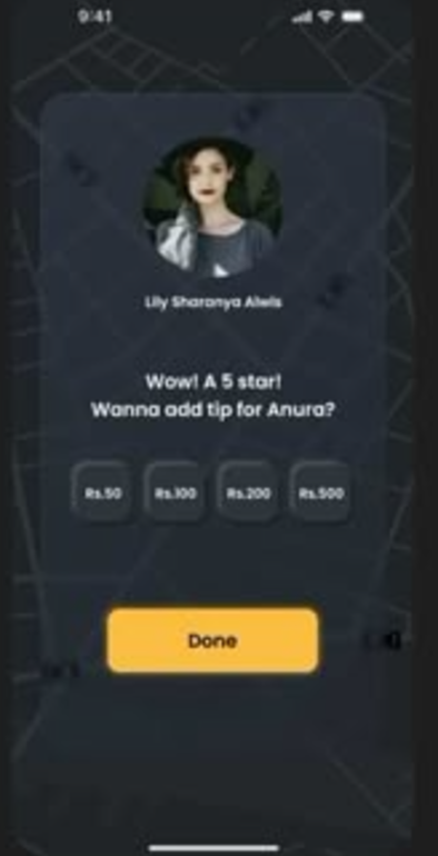
End on a high note.
The trip closes on the driver's photo and name, a warm “Wow! A 5 star! Wanna add tip?” prompt, and a row of one-tap tip chips, Rs 50, Rs 100, Rs 200, Rs 500. One gold Done button finishes it, so rewarding a great driver takes a second, not a decision.
- Driver photo and name front and centre after the ride
- Preset tip chips that turn generosity into one tap
- A single Done button to close the loop cleanly
Brand, sign in, set off.
Beyond the three headline moments, the same dark taxi-gold system carries the brand splash, a low-friction login and the find-a-ride start.
Dark, electric, repeatable.
Everything ships as named tokens and reusable components, so the Ridezilla team can add a wallet, scheduled rides or the next vehicle type without redrawing a screen.
One electric gold carries every action and pin, and tints the route and tabs; everything else is charcoal, depth and photography. Buttons, chips and cards share a single generous corner radius.
A heavy display face carries the loud earnings headlines while a clean sans does the everyday work, so the app feels bold but never noisy.
9 weeks, four moves.
Discover
Driver and rider interviews, a teardown of ride apps, and the recruit-book-rate journey mapped before any UI.
Brand & design
The Ridezilla identity, the dark taxi-gold system, and high-fidelity screens for both the rider and driver flows.
Build
Cross-platform native development with live maps, the vehicle picker and the tip flow wired into the design system.
Launch
QA, store submission for both platforms, and a handoff the in-house team can run with.
What it delivered.
Across both stores in its first weeks. Riders kept mentioning how fast and effortless booking a car felt.
From sign-up to a validated, road-ready driver, with an onboarding that finally sells the earnings.
Rider and driver apps shipped together from one documented system the team now extends.
We needed drivers to sign up and riders to book without thinking. Siznex gave us something that looks premium and moves fast, and a system we keep adding to without losing the craft.
Have an app in your head?
Brand, design and a native build under one roof, on one timeline. Tell us what you're trying to ship and a real human replies within 24 hours with a plan, not a sales deck.