
Every story, from art to politics.
Newzia is a news-reader built to feel calm instead of frantic. We built the whole product, from the brand and a deep-navy reading UI to the native iOS and Android app.
A newsstand that doesn't shout.
Most news apps fight for attention with red urgency dots and a feed that never stops moving. Newzia wanted the opposite: a calm, editorial reader where a single story gets room to breathe and the act of reading feels chosen, not pushed.
Make the news feel curated and worth your time, not an anxiety machine.
The look is deliberately quiet and deep-navy: full-bleed editorial photography, soft rounded cards, one confident red accent for actions, and generous space around every headline. We ran it from naming and brand through to the shipped native build on both platforms.
- P1Noise over signal. Endless badges and breaking-news urgency burn readers out, so the feed needed a calm, confident hierarchy.
- P2Sources worth trusting. Readers wanted to follow specific publishers, not surrender to an anonymous algorithm.
- P3One small team, both stores. iOS and Android had to launch together on a tight runway.
Three screens, one calm read.
A welcome that sets the tone, a feed that mixes browsing and reading, and a publisher profile you can actually follow.
From art to politics, anything.
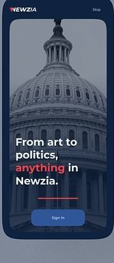
The opening screen sets the whole tone: a full-bleed photo of the US Capitol dome dimmed to deep navy, the Newzia wordmark, and the line “From art to politics, anything in Newzia” with one word picked out in red. A single Sign In button, a quiet Skip in the corner, nothing else to learn.
- Full-bleed editorial photography dimmed into a navy gradient
- Wordmark plus a positioning line with a single red emphasis
- One Sign In button and a quiet Skip, zero friction
One feed, no noise.
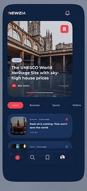
The home screen leads with a swipeable featured carousel, a full-bleed story like “The UNESCO World Heritage Site with sky-high house prices” tagged with its source and read time. Below sit the Latest, Business, Sports and Politics tabs and a clean list of headline cards, with a bottom bar for home, search, bookmarks and profile.
- Featured story carousel with source, bookmark and read time
- Latest, Business, Sports and Politics section tabs
- A persistent bottom bar: home, search, bookmarks, profile
Follow the bylines, not the algorithm.
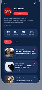
Tap a source and you land on its profile: the publisher’s logo and handle, a one-tap Follow, and a stat row for News, Followers, Following and Upvoted. Below it, that publisher’s latest stories stack in a scannable list, so readers build a feed they actually chose.
- Publisher header with logo, handle and a one-tap Follow
- Stat row: News, Followers, Following and Upvoted
- The source’s latest stories in a scannable list
Welcome, browse, follow.
From the first hello to a publisher worth following, the experience lives across three screens.
Navy, calm, readable.
Everything ships as named tokens and reusable components, so the Newzia team can add a search view, a saved-stories tab or the next section without redrawing a card.
A stack of navies carries the whole UI while one red owns every action and badge. Cards, tabs and tiles share a single generous corner radius.
A single sans runs from the wordmark down to the byline. Weight and size set the hierarchy, so headlines and body never fight.
8 weeks, four moves.
Discover
Reader interviews, a teardown of the big news apps, and the mixed feed plus follow model mapped before any UI.
Brand & design
The Newzia identity, the calm deep-navy reading system, and high-fidelity screens for every flow.
Build
Cross-platform native development with the feed, section tabs and publisher profiles wired into the design system.
Launch
QA, store submission for both platforms, and a handoff the in-house team can run with.
What it delivered.
Across both stores in its first weeks. Readers kept calling the feed calm and easy to come back to.
iOS and Android launched on the same day from one cross-platform codebase, on budget.
Latest, Business, Sports and Politics, built on a documented system the team now extends.
We didn't want another anxiety machine. Siznex gave us a news app that feels calm and reads beautifully, and a system we keep adding to without breaking the quiet.
Have an app in your head?
Brand, design and a native build under one roof, on one timeline. Tell us what you're trying to ship and a real human replies within 24 hours with a plan, not a sales deck.