
Find the right doctor in three taps.
MediMacth is a find-a-doctor app that turns choosing a specialist from a chore into a thirty-second decision. We built the whole product, from the brand and a clean, trust-first UI to the native iOS and Android app.
 MediMacth · iOS
A whole clinic, in your pocket.
Booking a doctor usually means a maze of directories, dead phone lines and profiles that tell you nothing. MediMacth wanted the opposite: open the app, see doctors you can trust, and book one before you talk yourself out of it.
Make picking a specialist feel as easy as picking a restaurant, without losing the trust health demands.
The look is deliberately clean and trust-first: real doctor photography, soft rounded cards, a single confident royal blue, and ratings front and centre. We ran it from naming and brand through to the shipped native build on both platforms.
- P1Choice paralysis. Directories list hundreds of names with no signal; MediMacth had to surface a short, trustworthy shortlist fast.
- P2Trust before booking. People won't book a stranger, so profiles needed ratings, experience and a human photo up top.
- P3One small team, both stores. iOS and Android had to launch together on a tight runway.
Three screens, one decision.
A confident welcome, a feed of trustworthy doctors, and a profile built to earn the booking.
A mark, a promise, one button.
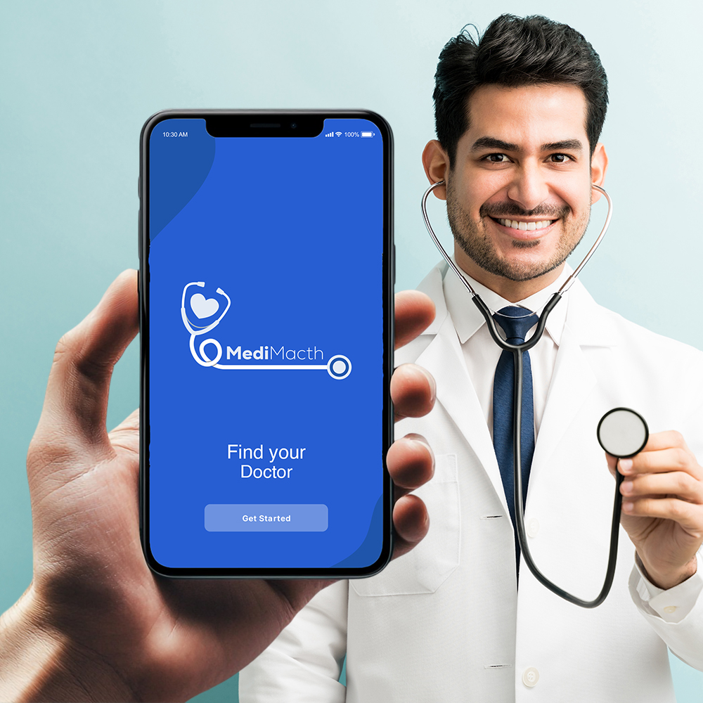
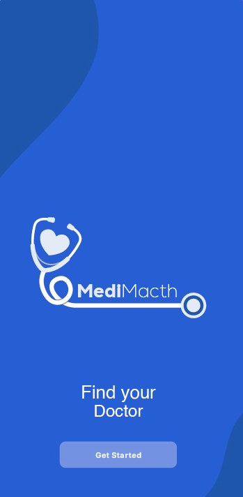
The opening screen sets the whole tone: the MediMacth stethoscope-and-heart logo on a deep blue gradient, the name in full, and the single line "Find your Doctor." One soft Get Started button, nothing else to learn.
- Stethoscope-and-heart wordmark on a royal-blue gradient
- The Find your Doctor positioning line, front and centre
- A single frosted Get Started button, zero friction

A shortlist you can trust.
Home opens with "Find your Doctor", your location pinned to Madrid, Spain, and a fat search bar. Below sits a grid of Favorite Doctors, each card a photo, name, specialty and star rating, with a one-tap add. The bottom bar keeps home, chat, records and more a thumb away.
- Location pin and a prominent Search Doctor field up top
- Two-up doctor cards with photo, specialty and a star rating
- Persistent bottom nav for home, chat, records and more

Everything you need to book.
Tap a doctor and it opens on a full-width portrait, a specialty pill and a star rating. A short About sits above three numbers that matter, Patients, Experience and Reviews, and a single fixed Book Appointment button you can reach without scrolling back up.
- Full-bleed portrait with a floating specialty pill
- Patients, Experience and Reviews in one quick-scan row
- A fixed, full-width Book Appointment call to action
Open, browse, book.
From the first hello to a booked appointment, the whole decision lives across three screens.
Clean, confident, repeatable.
Everything ships as named tokens and reusable components, so the MediMacth team can add a chat thread, a calendar or the next specialty without redrawing a card.
One royal blue carries every action and tints the soft cards and pills; everything else is white space and photography. Cards, search and buttons share a single generous corner radius.
A single rounded sans runs from the brand name down to the specialty labels. Weight and size set the hierarchy, so headings and body never fight.
9 weeks, four moves.
Discover
Owner interviews, a teardown of shop and content apps, and the read-and-shop feed mapped before any UI.
Brand & design
The MediMacth identity, the clean trust-first system, and high-fidelity screens for every flow.
Build
Cross-platform native development with search, doctor profiles and booking wired into the design system.
Launch
QA, store submission for both platforms, and a handoff the in-house team can run with.
What it delivered.
Across both stores in its first weeks. Patients kept mentioning how fast it was to find and book a doctor.
iOS and Android launched on the same day from one cross-platform codebase, on budget.
Welcome, profile, book. A documented system the team now extends to chat and records.
We didn't want another cold doctor directory. Siznex gave us an app that feels human and books in seconds, and a system we keep adding to without losing the trust.
Have an app in your head?
Brand, design and a native build under one roof, on one timeline. Tell us what you're trying to ship and a real human replies within 24 hours with a plan, not a sales deck.