
The whole pet aisle, made friendly.
Happy Tails is a pet-care app that pairs a shop for toys and treats with the guides owners actually read. We built the whole product, from the brand and a warm content-first UI to the native iOS and Android app.
 Happy Tails · iOS
Half shop, half how-to.
Most pet apps pick a lane: either a cold catalogue of products, or a wall of articles with nowhere to buy. Happy Tails wanted both in one place, and it wanted to feel like advice from a friend who happens to own the pet store.
Sell the treats, but earn the trust first with care guides people actually finish.
The look is deliberately warm and content-first: real animal photography, soft rounded cards, a single friendly royal blue, and a home screen that greets you by name. We ran it from naming and brand through to the shipped native build on both platforms.
- P1Shop or read, never both. Owners bounce between a store app and a blog; Happy Tails had to hold guides and products in one feed.
- P2Care advice that gets finished. Long, dense articles get abandoned, so reading had to feel light and photo-led.
- P3One small team, both stores. iOS and Android had to launch together on a tight runway.
Three screens, one happy pet.
A warm welcome, a feed that mixes reading and shopping, and an article built to be finished.
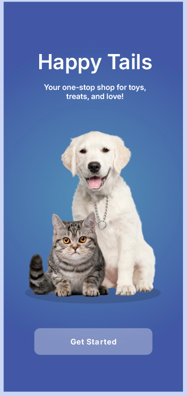
A puppy, a kitten, and a tagline.
The opening screen sets the whole tone: a golden puppy and a tabby cat cut out on a deep blue gradient, the name Happy Tails, and the line "Your one-stop shop for toys, treats, and love!" One soft Get Started button, nothing else to learn.
- Cut-out pet photography on a royal-blue gradient
- Wordmark plus the toys, treats and love positioning line
- A single frosted Get Started button, zero friction
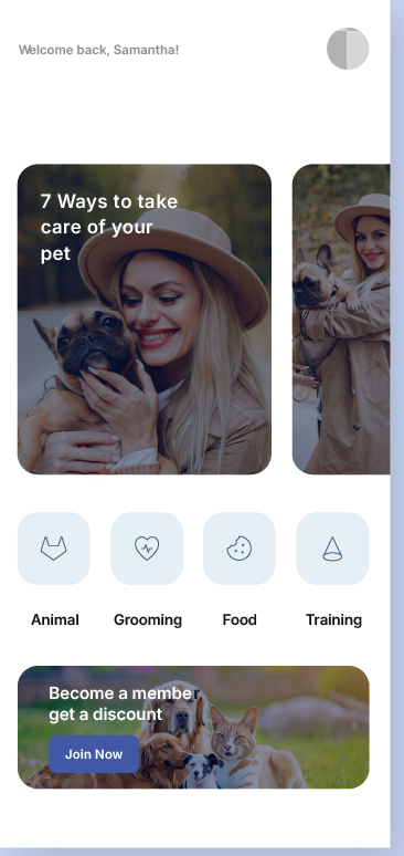
Read, browse, and shop.
The home screen opens with "Welcome back, Samantha!" and a swipeable carousel of care guides like 7 Ways to take care of your pet. Below sit four round category tiles, Animal, Grooming, Food and Training, then a membership banner offering a discount with a single Join Now.
- Personalised greeting and a swipeable featured-guide carousel
- Four category tiles for Animal, Grooming, Food and Training
- Membership banner with a discount and a Join Now action
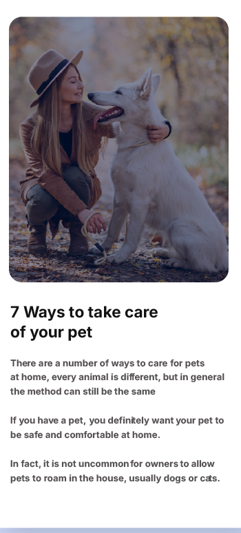
An article you'll actually finish.
Tap a guide and it opens on a full-width photo, the title 7 Ways to take care of your pet, and short, well-spaced paragraphs. Generous line height and plenty of white keep a long read feeling light, the way a friend would explain it, not a manual.
- Edge-to-edge hero photo with a rounded card crop
- Short paragraphs and roomy line height for easy reading
- A calm white canvas that lets the photography lead
Welcome, browse, learn.
From the first hello to a guide read end to end, the experience lives across three screens.
Warm, rounded, repeatable.
Everything ships as named tokens and reusable components, so the Happy Tails team can add a checkout, a vet booking or the next category without redrawing a card.
One royal blue carries every action and tints the soft category tiles; everything else is white space and photography. Cards and tiles share a single generous corner radius.
A single rounded sans runs from the brand name down to the greeting. Weight and size set the hierarchy, so headings and body never fight.
9 weeks, four moves.
Discover
Owner interviews, a teardown of shop and content apps, and the read-and-shop feed mapped before any UI.
Brand & design
The Happy Tails identity, the warm content-first system, and high-fidelity screens for every flow.
Build
Cross-platform native development with the content feed, categories and membership wired into the design system.
Launch
QA, store submission for both platforms, and a handoff the in-house team can run with.
What it delivered.
Across both stores in its first weeks. Owners kept mentioning how easy the care guides were to read.
iOS and Android launched on the same day from one cross-platform codebase, on budget.
Animal, Grooming, Food and Training, built on a documented system the team now extends.
We didn't want another cold pet store. Siznex gave us an app that reads like a friend and sells like a shop, and a system we keep adding to without breaking the warmth.
Have an app in your head?
Brand, design and a native build under one roof, on one timeline. Tell us what you're trying to ship and a real human replies within 24 hours with a plan, not a sales deck.