
Delicious, to your door.
Glacé is an ice cream delivery app that makes picking a flavour the fun part — browse by type, build your order, and check out in seconds. We built the whole product, from the brand and a soft lavender UI to the native iOS and Android app.
Browse, build, savour.
Most food-delivery apps treat ice cream as an afterthought — a flat list of SKUs with a tiny customise link. Glacé wanted the opposite: big, appetising photography, a shop you browse by style, and a product page where picking your size and seeing the nutrition is part of the treat.
Make ordering a scoop feel as fun as eating one.
The look is soft and indulgent: a signature lavender, rich berry photography, generous white space and a playful ice-cream-cone wordmark. We ran it from naming and brand through to the shipped native build on both platforms.
- P1Flat menus, no appetite. Text-heavy lists don’t sell ice cream; the shop had to lead with photography and category-first browsing.
- P2Customising felt like a chore. Size, quantity and nutritional details were buried, so the product builder had to be front and centre.
- P3Checkout killed momentum. The cart and payment screens had to be as airy and confidence-building as the shop itself.
Three screens, one perfect scoop.
A splash that sets the mood, a discovery feed that sells by sight, and a product page built for tweaking.
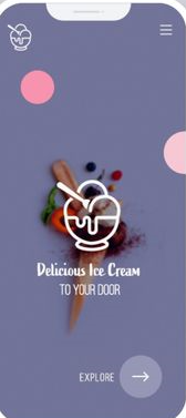
Set the mood first.
The opening screen is pure delight: a full-bleed lavender canvas, soft pink bubble accents, a photoreal waffle cone and the words “Delicious Ice Cream TO YOUR DOOR” in an elegant serif. One soft Explore → pill and nothing else — no sign-up wall, just the promise of something sweet.
- A signature lavender with soft pink bubbles and cone photography
- Elegant mixed-case serif headline, confident but never loud
- One Explore arrow — zero friction from first open
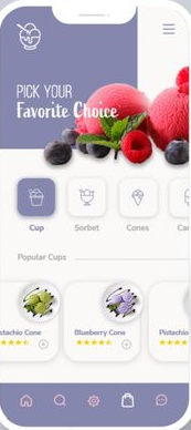
Browse it by craving.
Home opens with a bold “PICK YOUR Favorite Choice” hero shot of real fruit and berries, then a horizontal category strip — Cup, Sorbet, Cones and more. Below, a Popular Cups card grid: name, star rating and a heart toggle in one dense but airy tile.
- Full-bleed berry photography that sells before you scroll
- Category icons for genre-first browsing — Cup, Sorbet, Cones and more
- Card grid with name, rating and wishlist heart at a glance
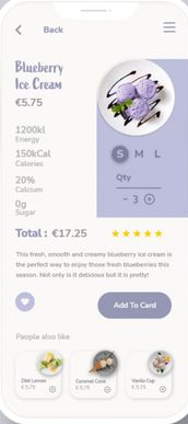
Make it exactly right.
Tap a flavour and it opens on a hero photo with a nutrition panel — 1200kl Energy, 150kCal, 20% Calcium — then a size chip row (S, M, L) and a quantity stepper. Total updates live: €17.25. A five-star rating sits above the flavour description and one bold Add To Card button closes the deal.
- Nutrition facts upfront — energy, calories, calcium, sugar
- S / M / L chip row and a live-updating quantity stepper
- A People also like carousel keeps upsell light and appetising
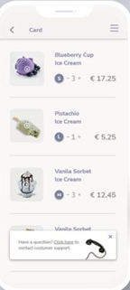
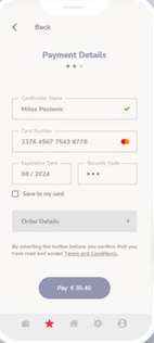
Cart, pay, enjoy.
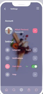
Beyond the three headline moments, the same lavender system carries the cart, a clean payment form and account settings.
Soft, sweet, repeatable.
Everything ships as named tokens and reusable components, so the Glacé team can add a seasonal flavour, a loyalty card or a dark mode without redrawing a screen.
Lavender carries every primary action and active tab state; a warm berry pink handles accent moments like the wishlist heart and upsell chips. Everything else is white, generous padding and food photography.
An italic serif lifts the brand headline and section accents; a clean geometric sans handles every product label, price and button — legible and light without ever feeling clinical.
8 weeks, four moves.
Discover
Ice cream lover interviews, a teardown of food-delivery apps, and the browse–build–checkout journey mapped before any UI.
Brand & design
The Glacé identity, the soft lavender system, and high-fidelity screens for the full order flow from splash to payment.
Build
Cross-platform native development with category browsing, the live-total cart and the payment form wired into the design system.
Launch
QA, store submission for both platforms, and a handoff the in-house team can run with.
What it delivered.
Across both stores in its first weeks. Users loved how appetising and fast the ordering experience felt.
The entire flow from opening the app to tapping Pay takes under a minute for a returning user.
Cup, Sorbet, Cones and more — on a system the team extends with each new seasonal range.
We wanted the app to make people hungry before they even tapped order. Siznex gave us something that looks delicious and checks out in seconds, and a system we keep adding flavours to.
Have an app in your head?
Brand, design and a native build under one roof, on one timeline. Tell us what you're trying to ship and a real human replies within 24 hours with a plan, not a sales deck.