
Great food, served dark and bold.
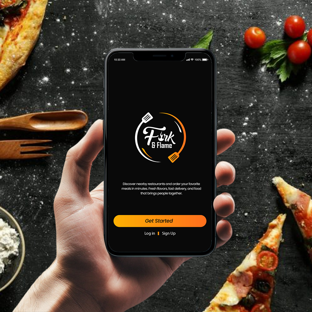
Fork & Flame is a food-discovery and delivery app that makes ordering dinner feel as appetising as the dish itself. We built the whole product, from the brand and a bold dark UI to the native iOS and Android app.
 Fork & Flame · iOS
Make the menu look as good as it tastes.
Most delivery apps drown great food in clutter: tiny thumbnails, endless lists and a checkout that feels like admin. Fork & Flame wanted the opposite, an app where the photography does the selling and ordering gets out of the way.
If the dish looks irresistible on screen, the order takes care of itself.
The look is deliberately dark and bold: near-black canvases that let food photography glow, a single warm gold-to-orange gradient for every action, and big, confident type. We ran it from naming and brand through to the shipped native build on both platforms.
- P1Food that looks flat. Bright, busy UIs wash out photography; the app needed a dark stage that makes every plate pop.
- P2Discovery, not scrolling. Endless lists tire people out, so categories, a featured banner and Popular Picks had to surface choices fast.
- P3One small team, both stores. iOS and Android had to launch together on a tight runway.
Four screens, one craving.
A bold welcome, an onboarding that locates you, a discovery home, and a dish detail built to fill the cart.
A logo that looks hand-lettered.
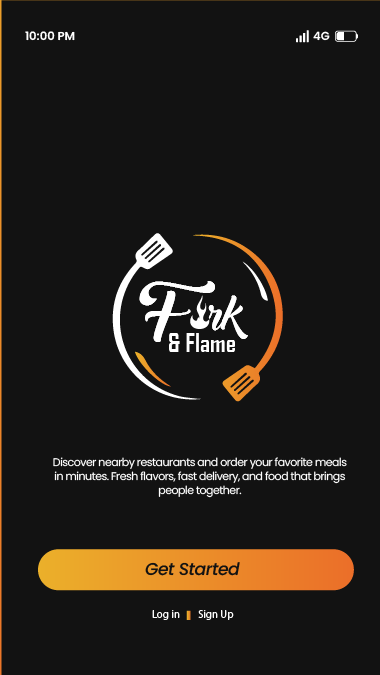
The opening screen sets the whole tone: the Fork & Flame mark, a spatula and a flame circling script type on near-black, the line "Discover nearby restaurants and order your favorite meals", and a single gold Get Started button with quiet Log in and Sign Up beneath.
- Hand-lettered logo with spatula and flame on near-black
- One warm gold-to-orange Get Started button
- Secondary Log in and Sign Up kept quiet underneath
Find food near you.
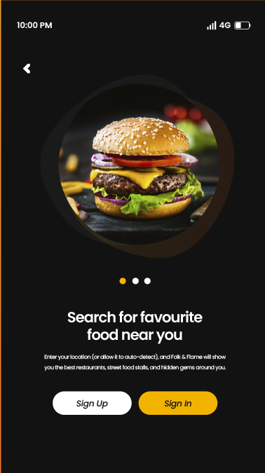
A spotlit burger sits in a circular crop above the headline "Search for favourite food near you." A line of dots shows the onboarding progress, and a clear pair of Sign Up and Sign In buttons closes the screen, location permission framed as a benefit, not a hurdle.
- Circular hero crop that makes the dish the focus
- Dot indicator for a short, skimmable onboarding
- Paired Sign Up and Sign In, one filled, one outlined
Built to make you hungry.
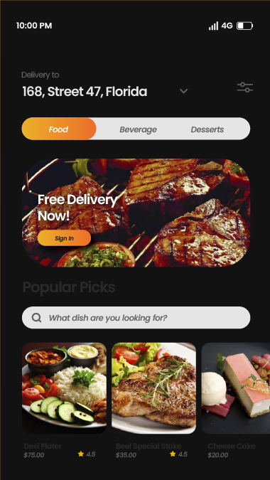
Home leads with your delivery address, then Food, Beverage and Desserts tabs, a glowing Free Delivery Now! banner, a dish search and a Popular Picks rail. Every card carries a big photo, a price and a star rating, so choosing is a glance, not a chore.
- Editable delivery address and category tabs up top
- A promo banner and a Popular Picks rail for fast discovery
- Photo-led cards with price and rating on every dish
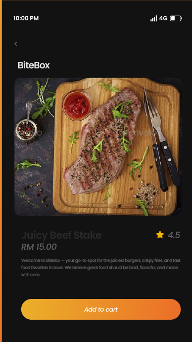
One tap from cart.
Tap a dish and it opens on a full-width photo, the restaurant name BiteBox, the title Juicy Beef Stake, a RM 15.00 price and a 4.5 rating. A short, appetising description sits above a single fixed Add to cart button you can always reach.
- Edge-to-edge dish photo with restaurant and rating
- Clear price and a short, mouth-watering description
- A fixed, full-width Add to cart call to action
Open, discover, order.
From the first hello to a dish in the cart, the whole journey lives across four screens.
Dark, warm, repeatable.
Everything ships as named tokens and reusable components, so the Fork & Flame team can add a checkout, a tracking map or the next category without redrawing a card.
A near-black canvas lets food photography glow, while one gold-to-orange gradient carries every primary action. Cards, banners and buttons share a single generous corner radius.
A single bold sans runs from dish names down to prices and ratings. Weight and size set the hierarchy, so headings and body never fight.
10 weeks, four moves.
Discover
Diner interviews, a teardown of delivery apps, and the open-to-cart journey mapped before any UI.
Brand & design
The Fork & Flame identity, the bold dark system, and high-fidelity screens for every flow.
Build
Cross-platform native development with discovery, dish detail and cart wired into the design system.
Launch
QA, store submission for both platforms, and a handoff the in-house team can run with.
What it delivered.
Across both stores in its first weeks. Diners kept mentioning how good the food looked in-app.
iOS and Android launched on the same day from one cross-platform codebase, on budget.
Welcome, discover, dish, add. A documented system the team now extends to checkout and tracking.
We wanted an app that makes people hungry the second it opens. Siznex gave us a dark, bold look that sells the food for us, and a system we keep building on.
Have an app in your head?
Brand, design and a native build under one roof, on one timeline. Tell us what you're trying to ship and a real human replies within 24 hours with a plan, not a sales deck.