
A bank that fits in one hand.
BrixBank came to us with a name and an ambition. We left them with a complete mobile banking product — brand, interface, design system and a native app shipped on iOS and Android.
 BrixBank · iOS
Banking that feels human.
BrixBank wanted to reach a generation that has never set foot in a branch — people who expect their money to live on their phone, move in a tap, and never make them feel stupid.
The category looks intimidating. BrixBank wanted to feel like a partner.
So the brief wasn't really "build an app." It was: take everything heavy about banking — the jargon, the dense screens, the anxiety of hitting send on a payment — and make it feel light. We owned the whole arc: brand identity, product design, a reusable design system, and the native build.
- P1No visual identity. A name, no logo, no system — every screen would have been a one-off.
- P2Trust on a small screen. People hand a bank their money. The interface has to earn that in seconds.
- P3Two platforms, one team. iOS and Android had to ship together, on a startup timeline and budget.
Four screens that carry the whole product.
Every flow ladders up to the same feeling — warm, certain, in control. Here's how that shows up in the moments that matter most.
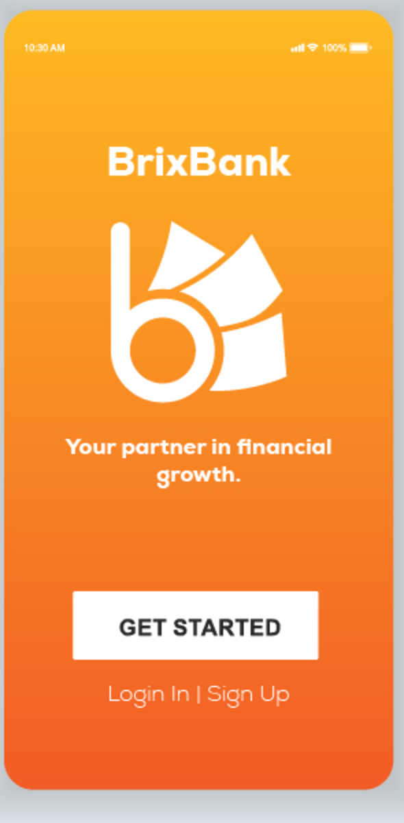
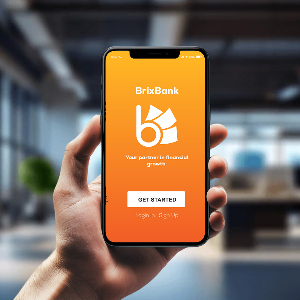
A mark, a gradient, and a promise.
The identity starts with the "b" monogram — a stack of building blocks that reads as both a bank and a foundation. A warm orange-to-amber gradient does the emotional work that fintech usually leaves to cold blues.
- Custom monogram, wordmark and app icon system
- One sentence of positioning — "your partner in financial growth"
- A single, unmissable Get Started path
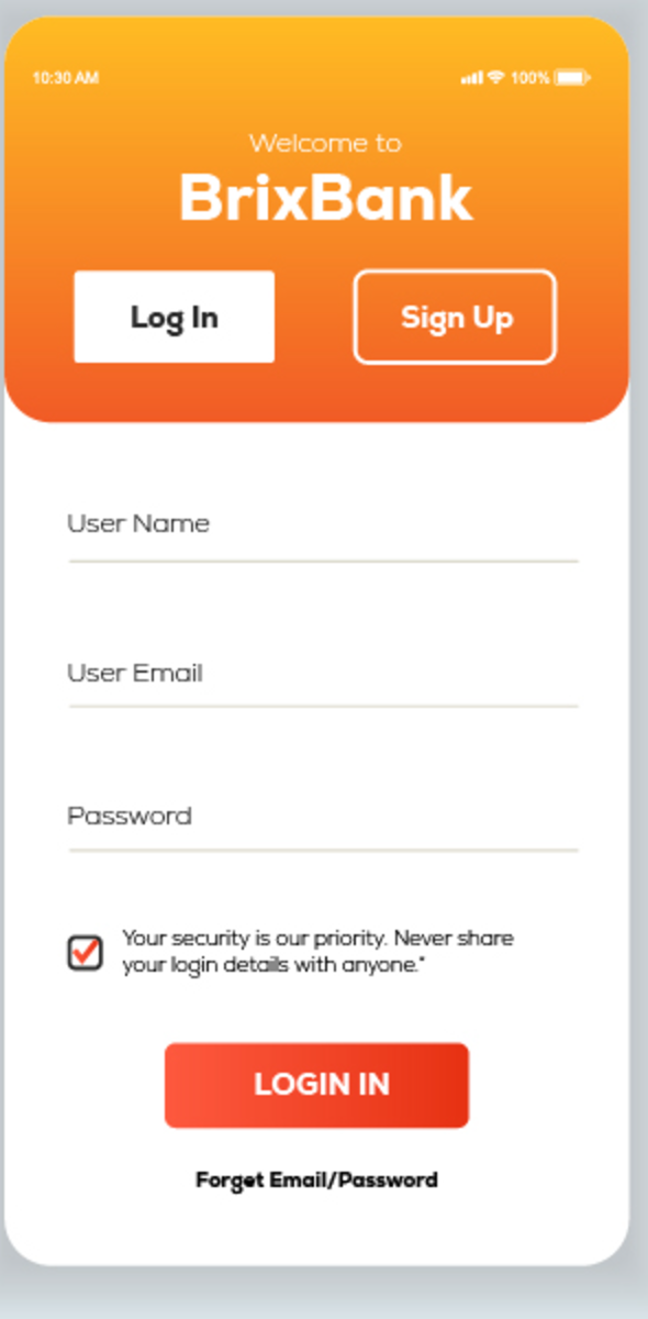
Sign-up that reassures as it asks.
The riskiest screen in any bank is the first form. We kept it to three fields, surfaced a plain-language security note right where doubt creeps in, and split log-in from sign-up so no one ever feels lost.
- Three-field form, generous tap targets, no clutter
- Inline security reassurance instead of fine print
- Clear recovery path — never a dead end
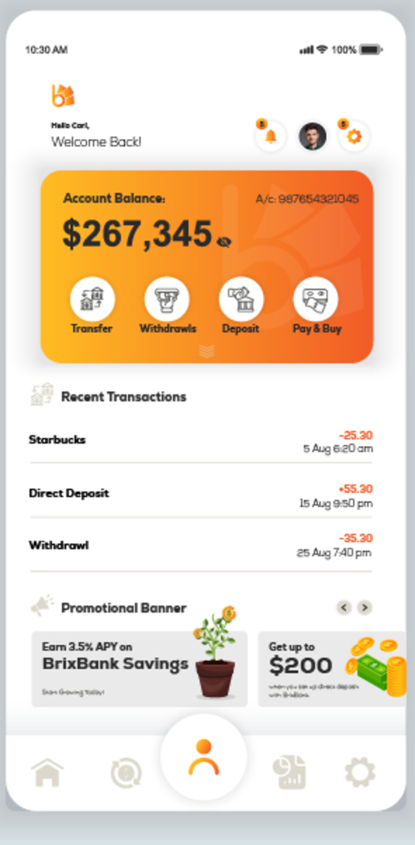
Your money, readable at a glance.
The home screen answers the only two questions that matter on open — how much do I have, and what just happened? A single balance card holds the four core actions; recent activity and offers sit calmly beneath it.
- Balance card with Transfer, Withdraw, Deposit & Pay
- Color-coded transactions — credit green, debit red
- Persistent tab bar with a thumb-friendly action hub
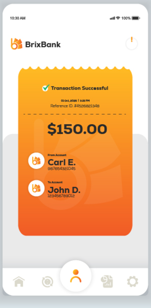
The moment a payment lands.
We designed the confirmation as a receipt you'd actually keep — torn-paper edge, a big confident amount, both parties named, and a reference ID. The anxiety of "did it go through?" disappears before it starts.
- Receipt-style success state with full transaction detail
- From / To accounts shown explicitly, never ambiguous
- Reference ID and timestamp for peace of mind
Open, sign in, spend with confidence.
The five screens that take a new customer from first launch to their first completed payment.
Not screens — a system.
Everything ships as reusable tokens and components, so BrixBank's team can build the next fifty screens without us in the room.
A warm gradient ramp anchors the brand; a single deep neutral keeps body text and icons grounded. Two button styles and a status pill cover the entire app.
A single sans family scales from a hero balance down to a transaction reference — clear hierarchy, zero font-loading cost.
14 weeks, four moves.
Discover
User interviews, competitor teardown, and the core flows mapped before a single pixel.
Brand & design
Identity, the design system, and high-fidelity screens for every flow that ships.
Build
Cross-platform native development, wired to real services with the design system baked in.
Launch
QA, store submission for both platforms, and a handoff the in-house team can run with.
What it delivered.
Across both stores in the first weeks — early users called it the clearest banking app they'd used.
iOS and Android launched on the same day from one cross-platform codebase, on budget.
A documented design system the BrixBank team now extends on their own.
Siznex didn't just hand us screens — they handed us a product and a system to keep building it. Our first users keep telling us it doesn't feel like a bank. That was exactly the point.
Have an app in your head?
Brand, design, and a native build — under one roof, on one timeline. Tell us what you're trying to ship. A real human replies inside 24 hours with a plan, not a sales deck.